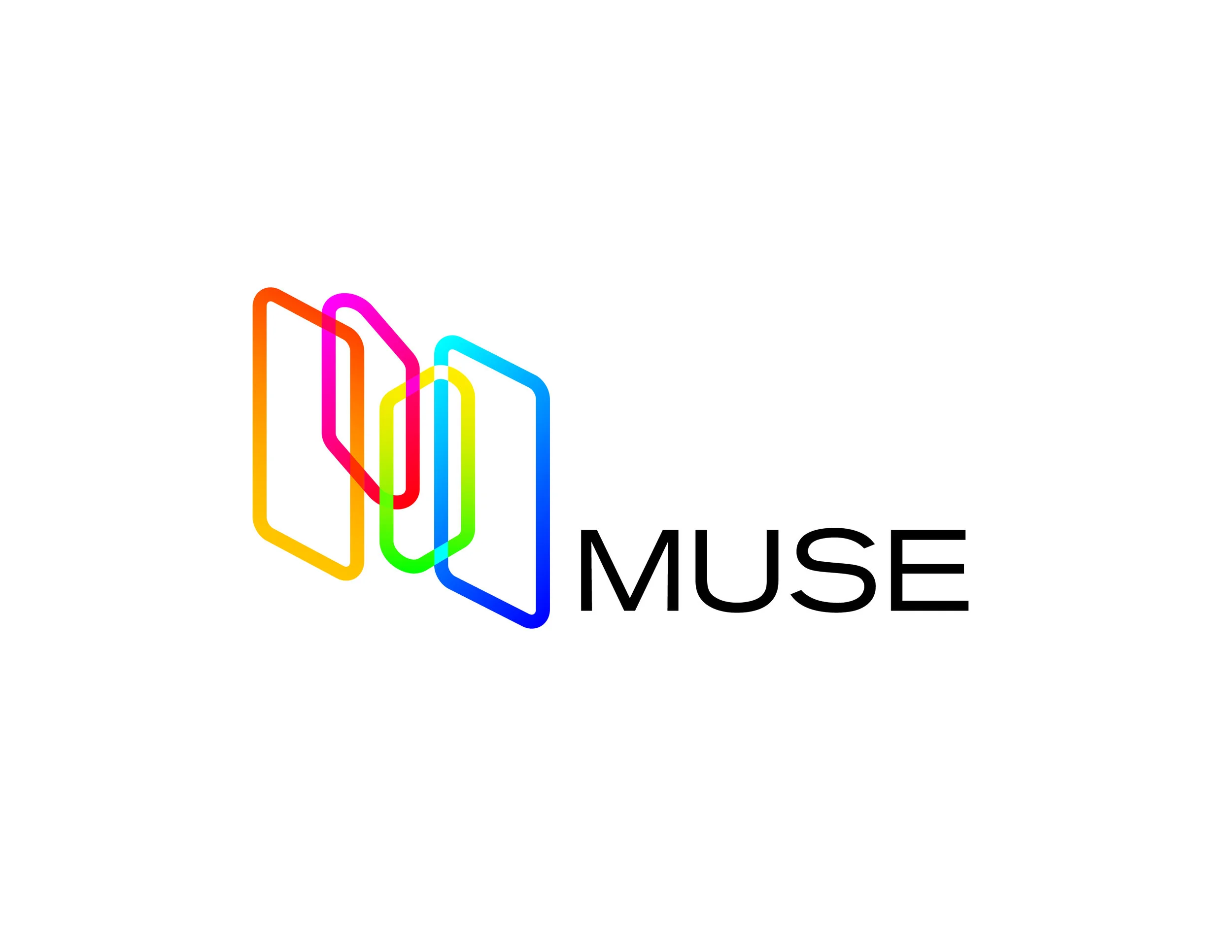
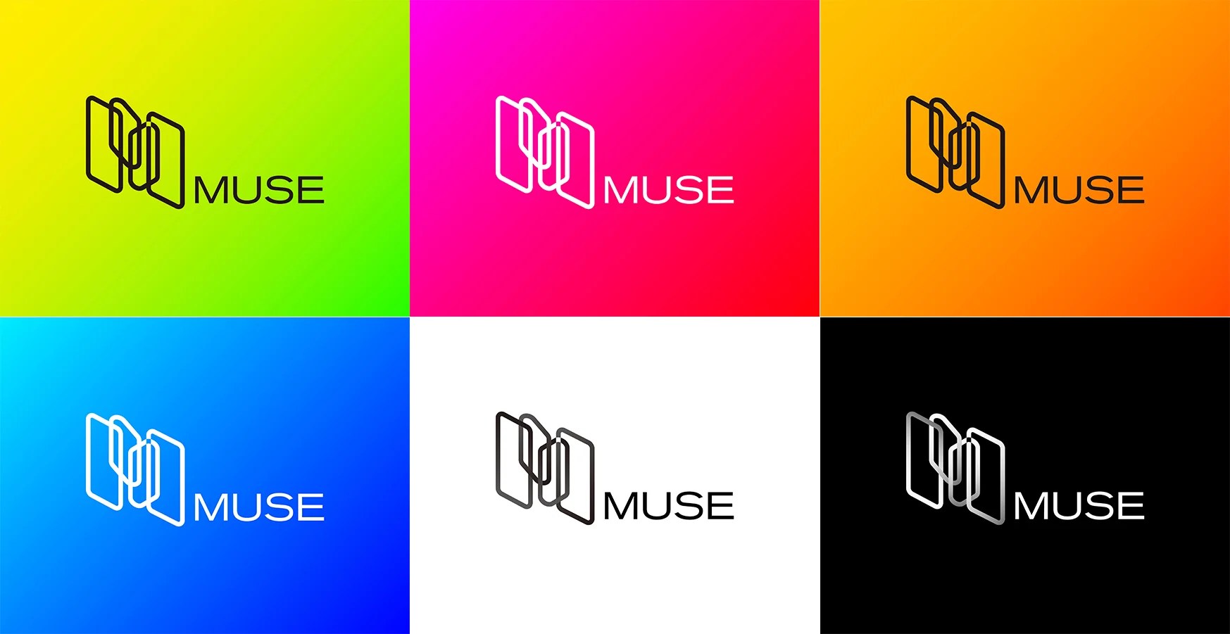
The MUSE logo portraits an artistic spirit using the abstract form of screens which represented by rounded rectangles. Four screens are weaved together to imply the continuation between scenes and scenes. Our creative staff is dedicated to providing our customer with the best quality of production. The thick outline of the rectangles with rounded corner is also representing the idea of "sophistication". Different from other competitors, we use a board range of colour, showing people that there is nothing we can not do in this industry.
The type is more serious compared to the form, this gives the logo a solid part that is stable, smart, and trustworthy to the customer on our professional execution.
A project of OCAD University.


